FORD ✦ FORD ✦ FORD ✦
✳︎ WHILE THE FORD BRAND CARRIES STRONG RECOGNITION, THE DIGITAL PLATFORM DIDN’T LIVE UP TO THIS: FRAGMENTED DESIGN PATTERNS, CONFUSING NAVIGATION, AND AN INCONSISTENT EXPERIENCE MADE IT HARD FOR USERS TO FIND WHAT THEY NEEDED.
THE CHALLENGE
How do we respect Ford’s established brand identity, while rebuilding a design system that feels fresh, intuitive and scalable?
OUR SOLUTION
We developed a modern and unified design system by standardizing patterns and components that could flex across markets. We kept the Ford experience recognizable across touchpoints, but still left room for flexibility and innovation.
THE HOLY GRAIL: NEW DESIGN PRINCIPLES
CRAFT WITH INTENTION
Authentic
Make decisions rooted in reason. Be thoughtful. Be purposeful. Be empathetic to human need.
LET IT BREATHE
Effortless
Make space. Create focus. Guide. We should be a breath of fresh air in a complex world.
STIR THE SOUL WITHIN
Passionate
Connect with people. Inspire optimisim. Spark imaginations. Create energy. Be bold but relatable. Tell real stories.
ADVANCE THE ICON
Purposeful Ingenuity
Forward advancement is in our blood. We stay true to our visionary heritage by showing up in unexpected ways.
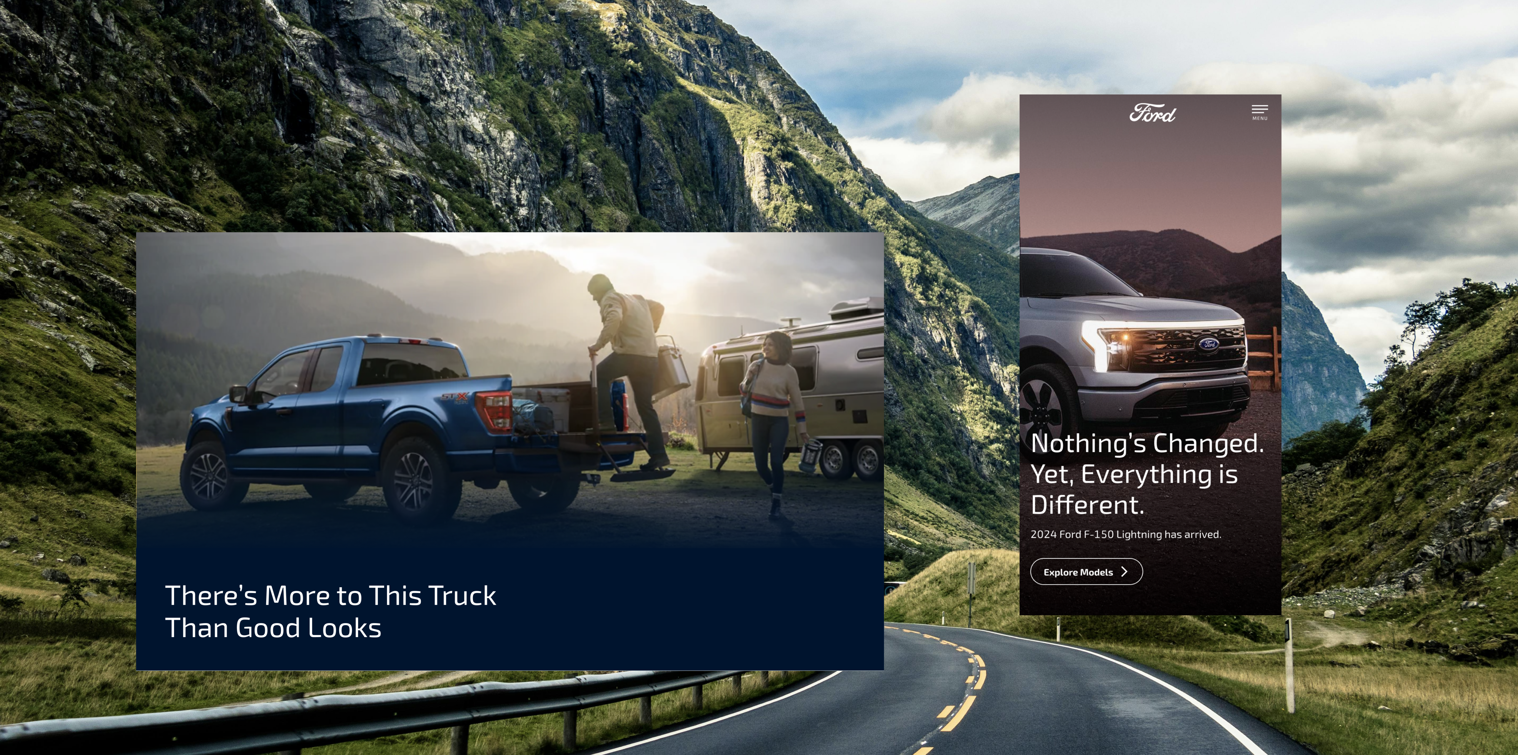
RESKINNED MOMENTS
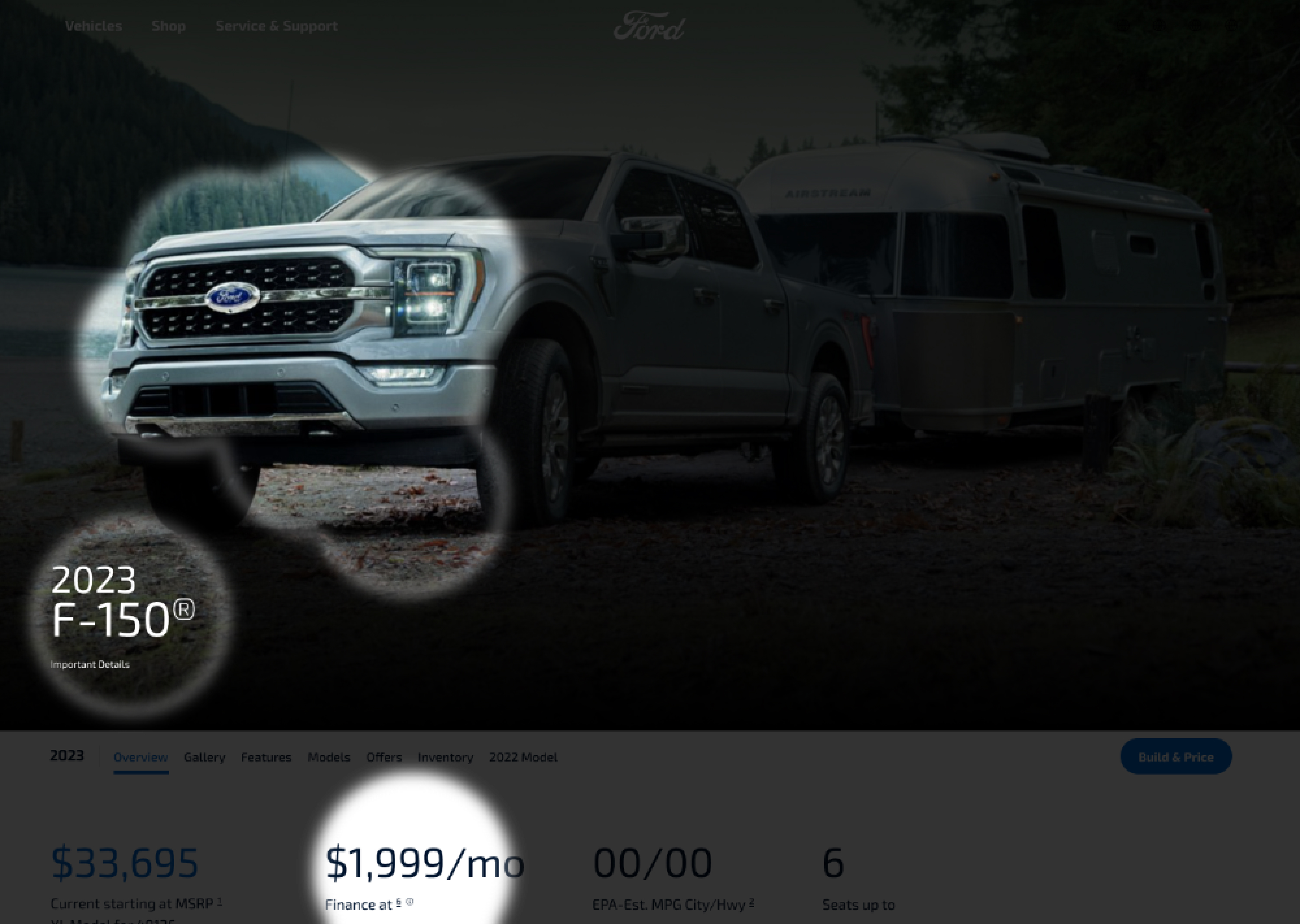
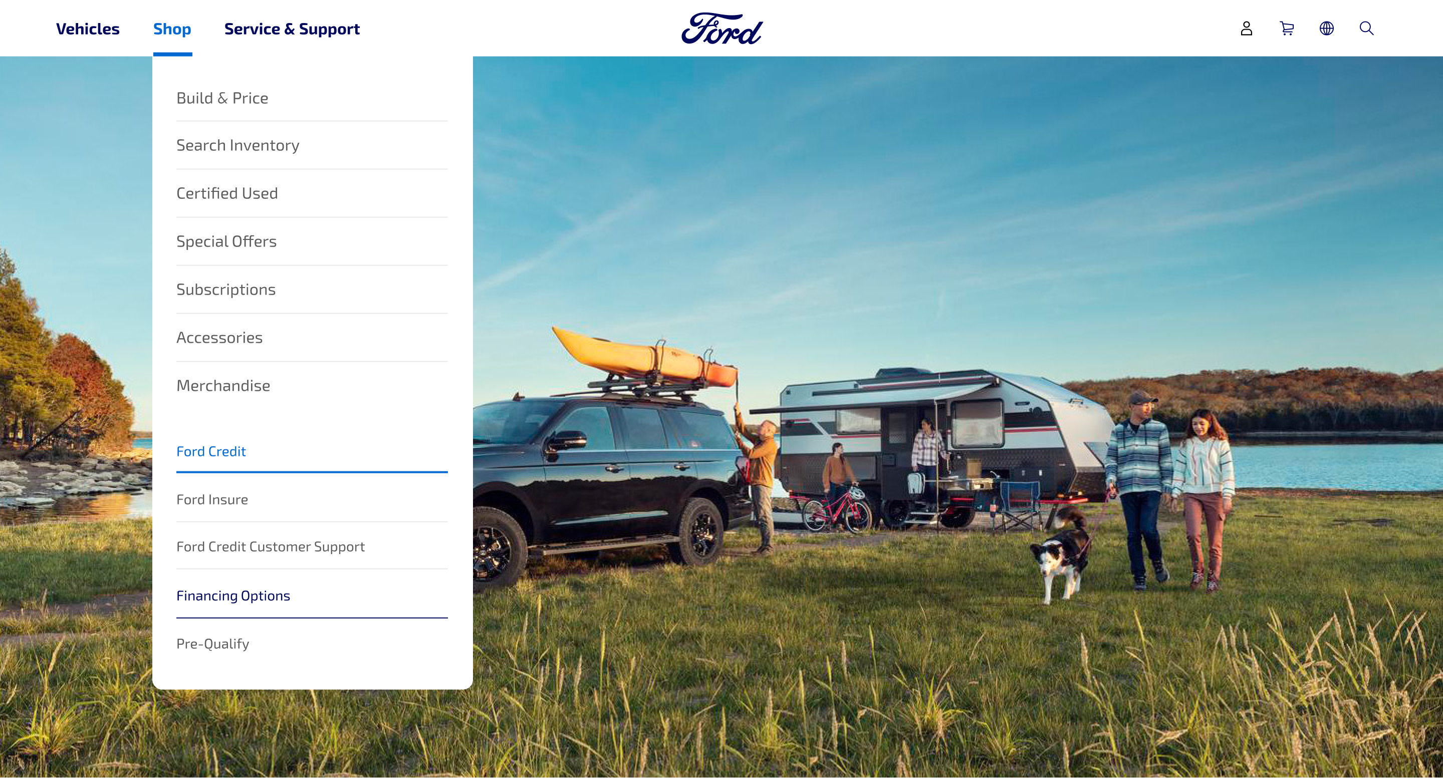
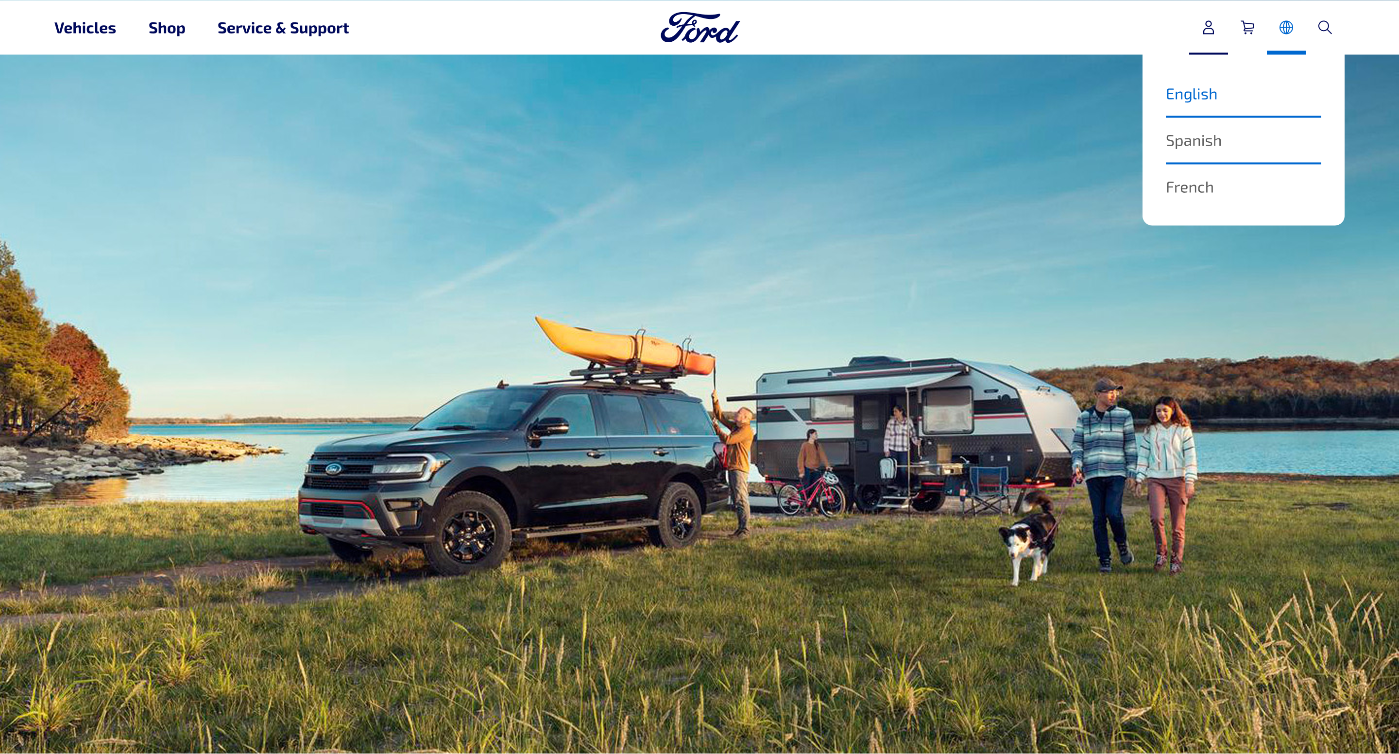
GLOBAL NAVIGATION
- Reduced the clutter by simplifying hierarchy with fewer clickable items.
- Integrated vehicle imagery for faster recognition

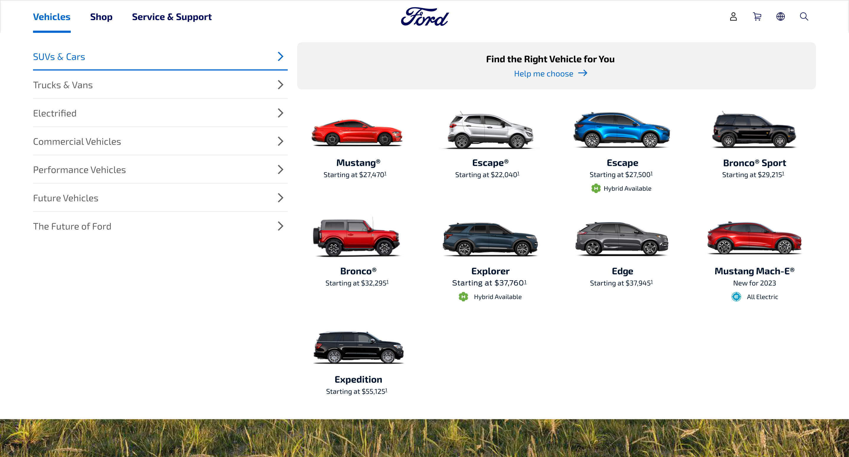
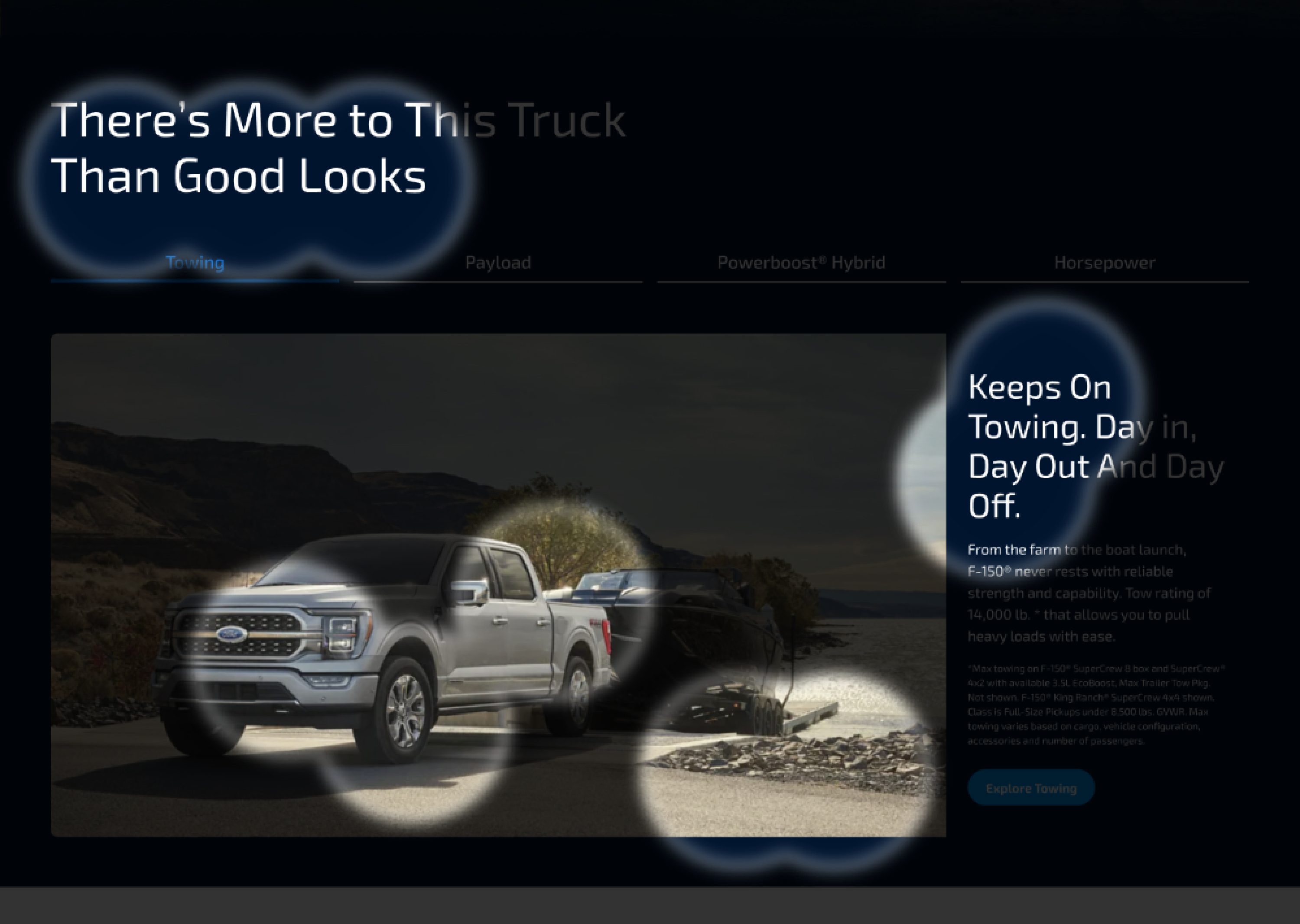
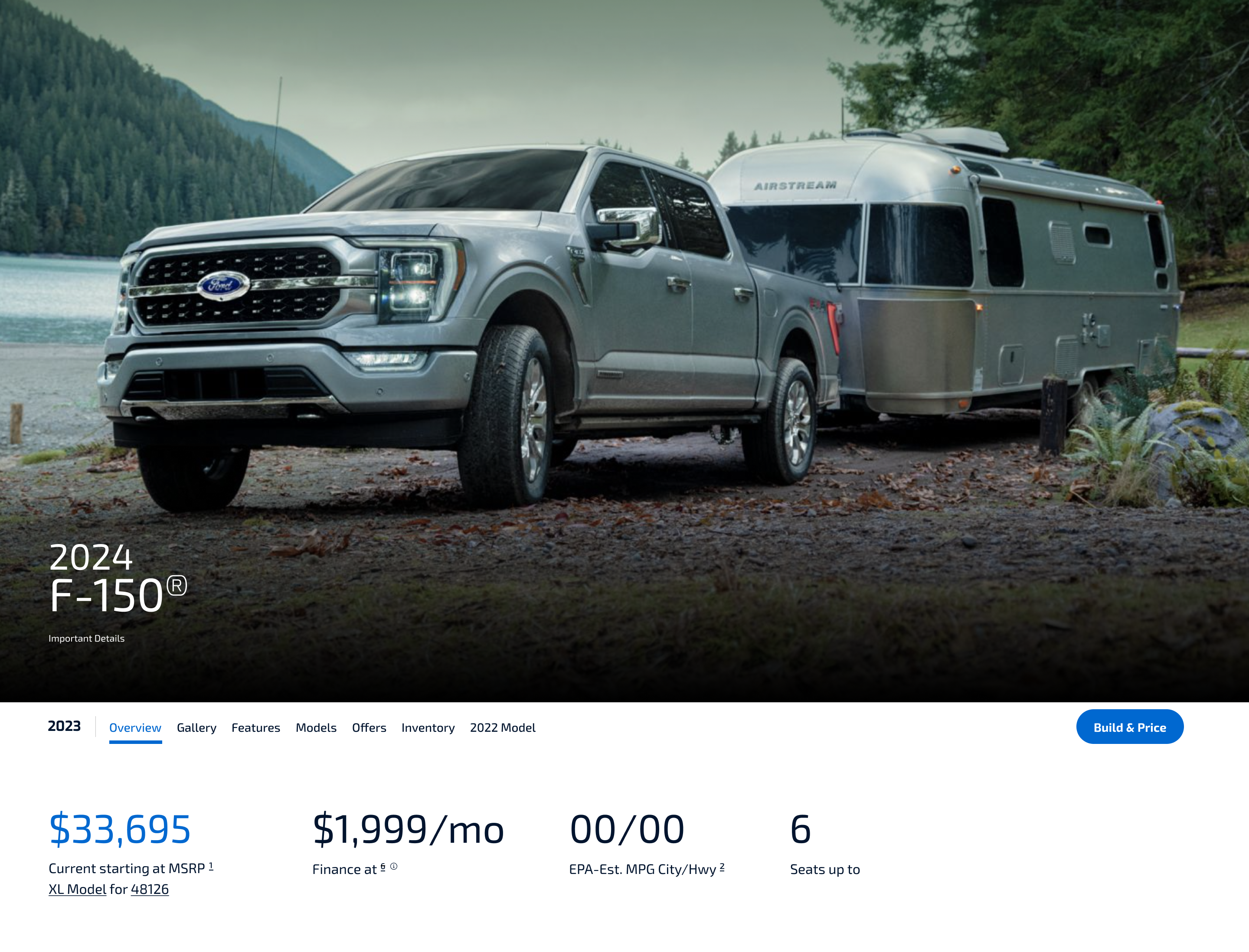
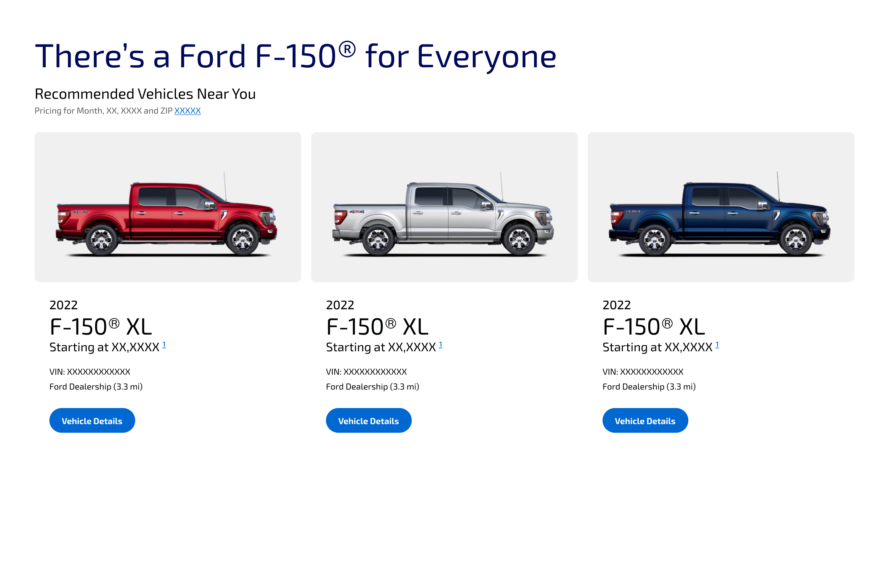
HERO BILLBOARD, SECONDARY NAVIGATION & VEHICLE ATTRIBUTES
- Emphasized bold photography to showcase vehicles
- Streamlined wayfinding through a refined secondary nav
- Surfaced key details (attributes, pricing, etc.) for easy scanning
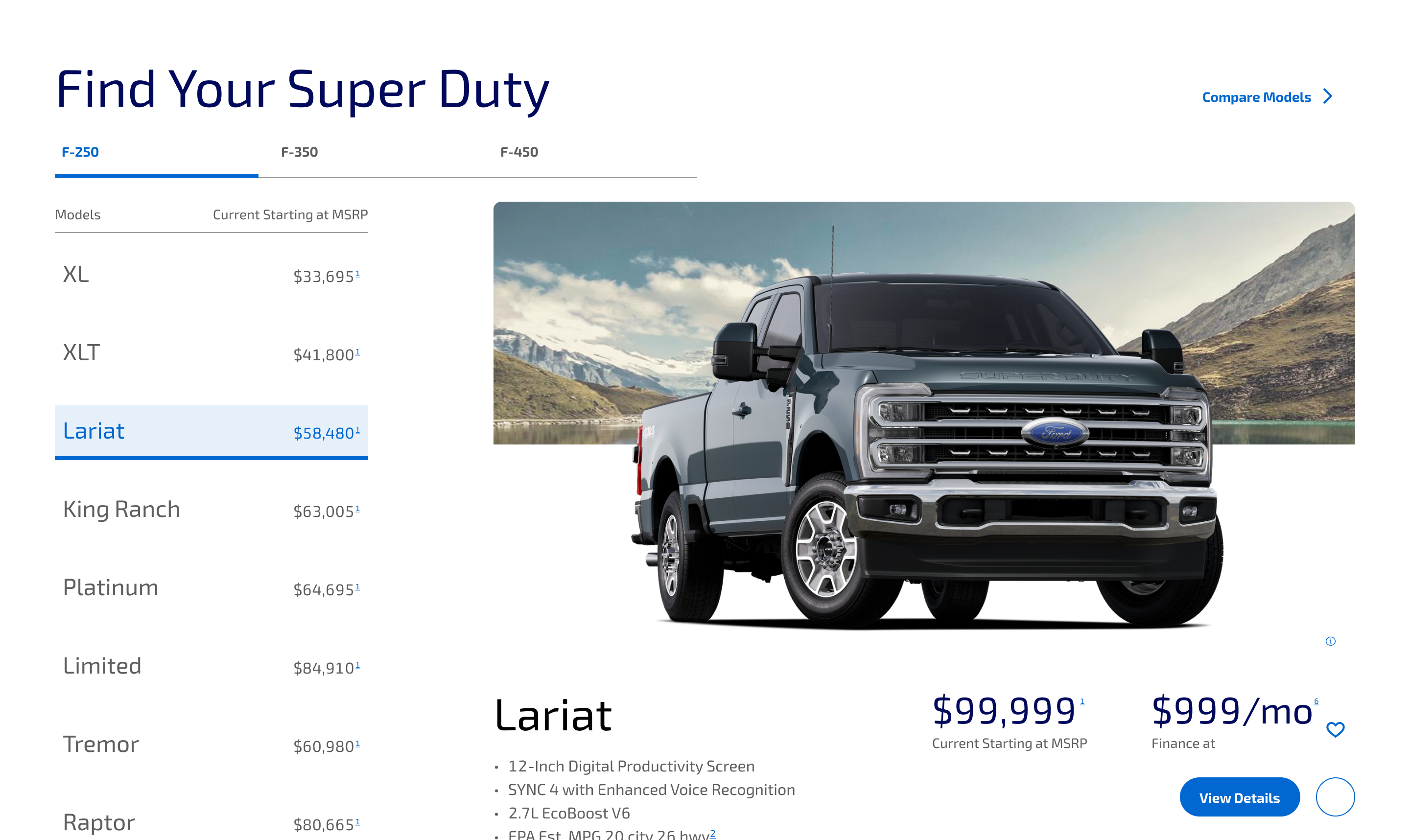
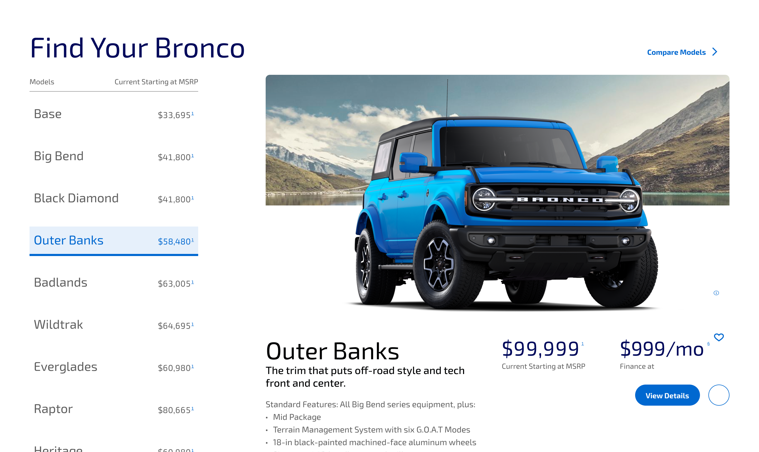
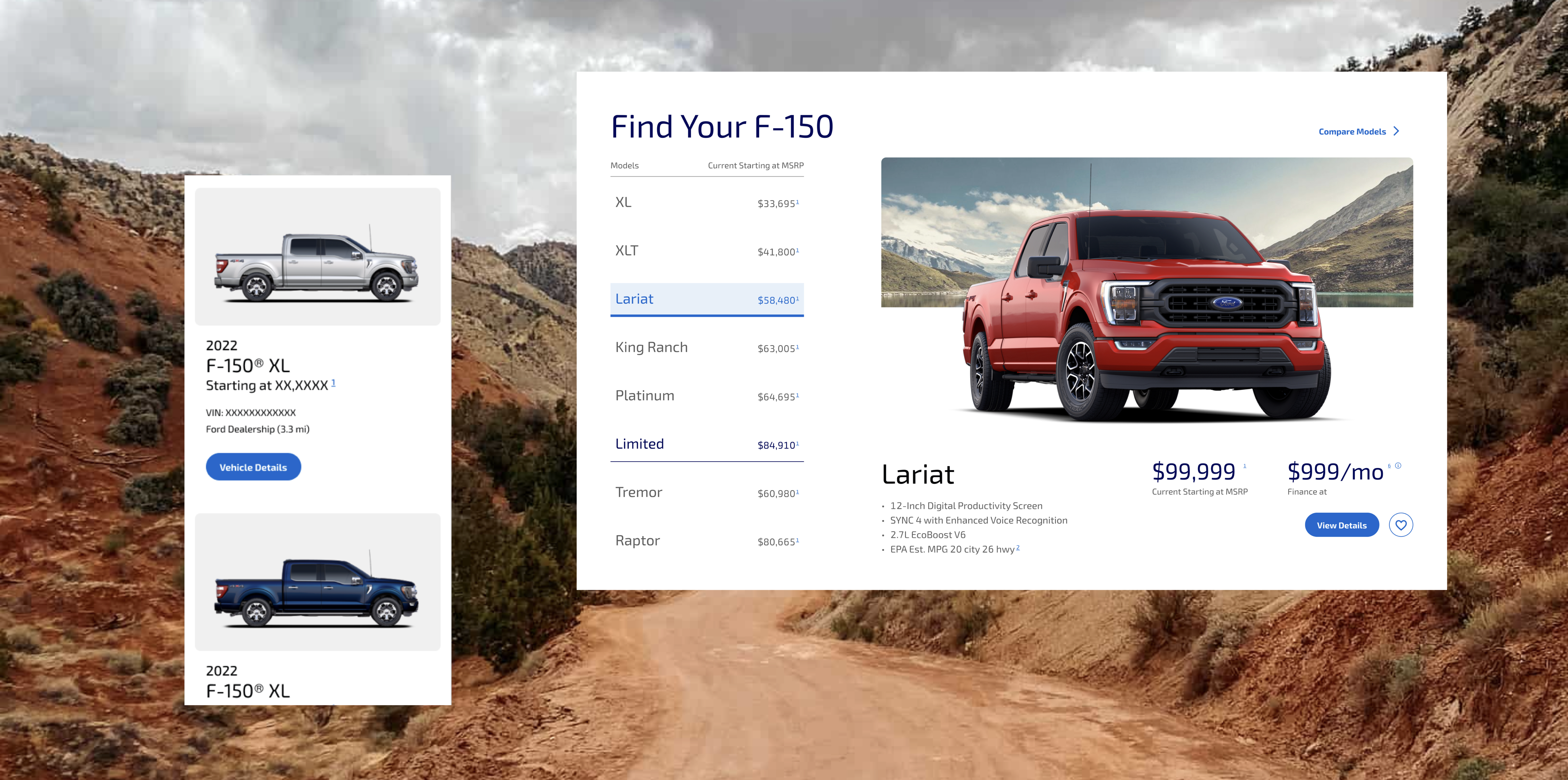
MODEL WALK-THRU
- Restructured layout to easily compare trims and pricing in one viewport, eliminating repetitive back-and-forth clicks
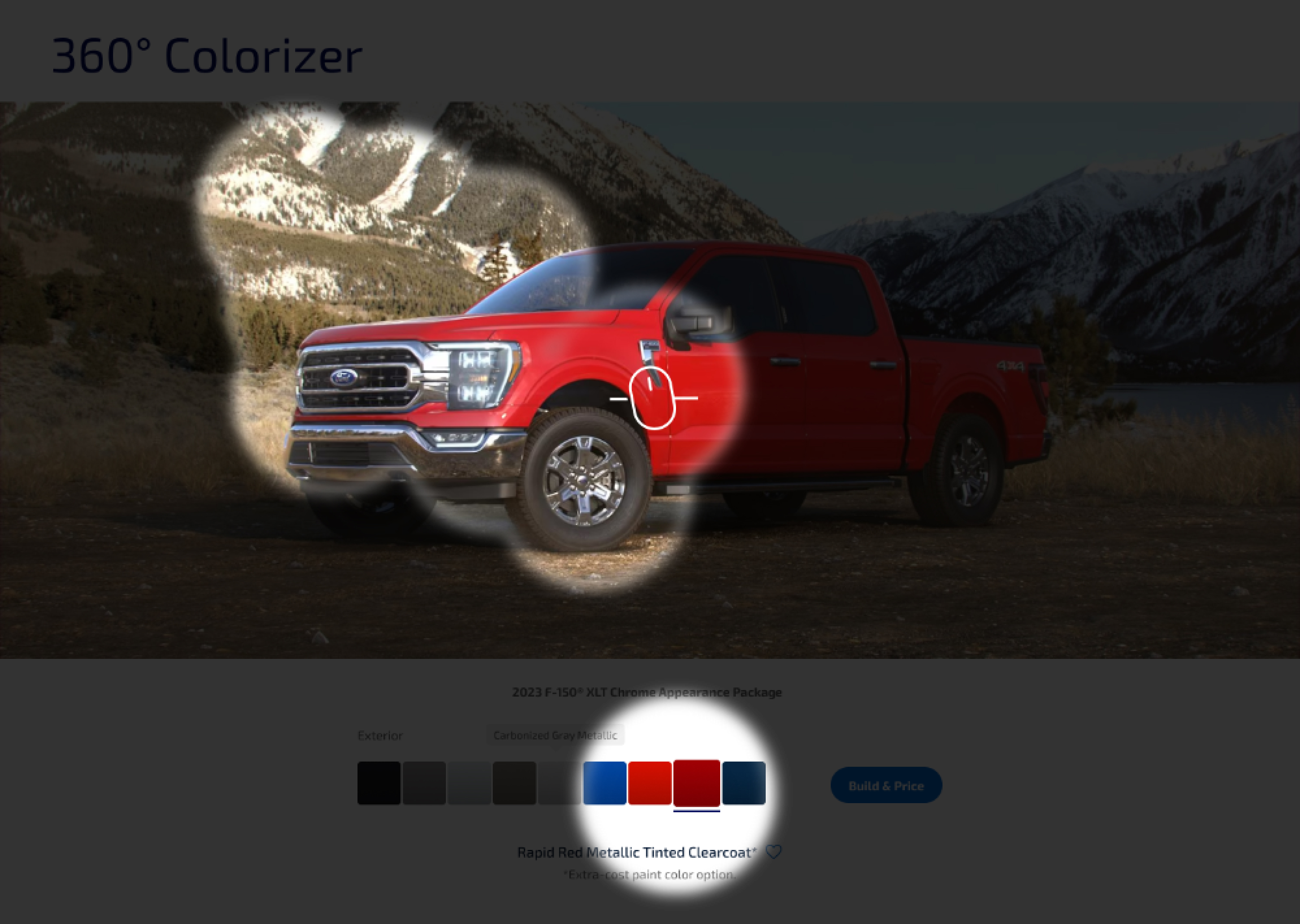
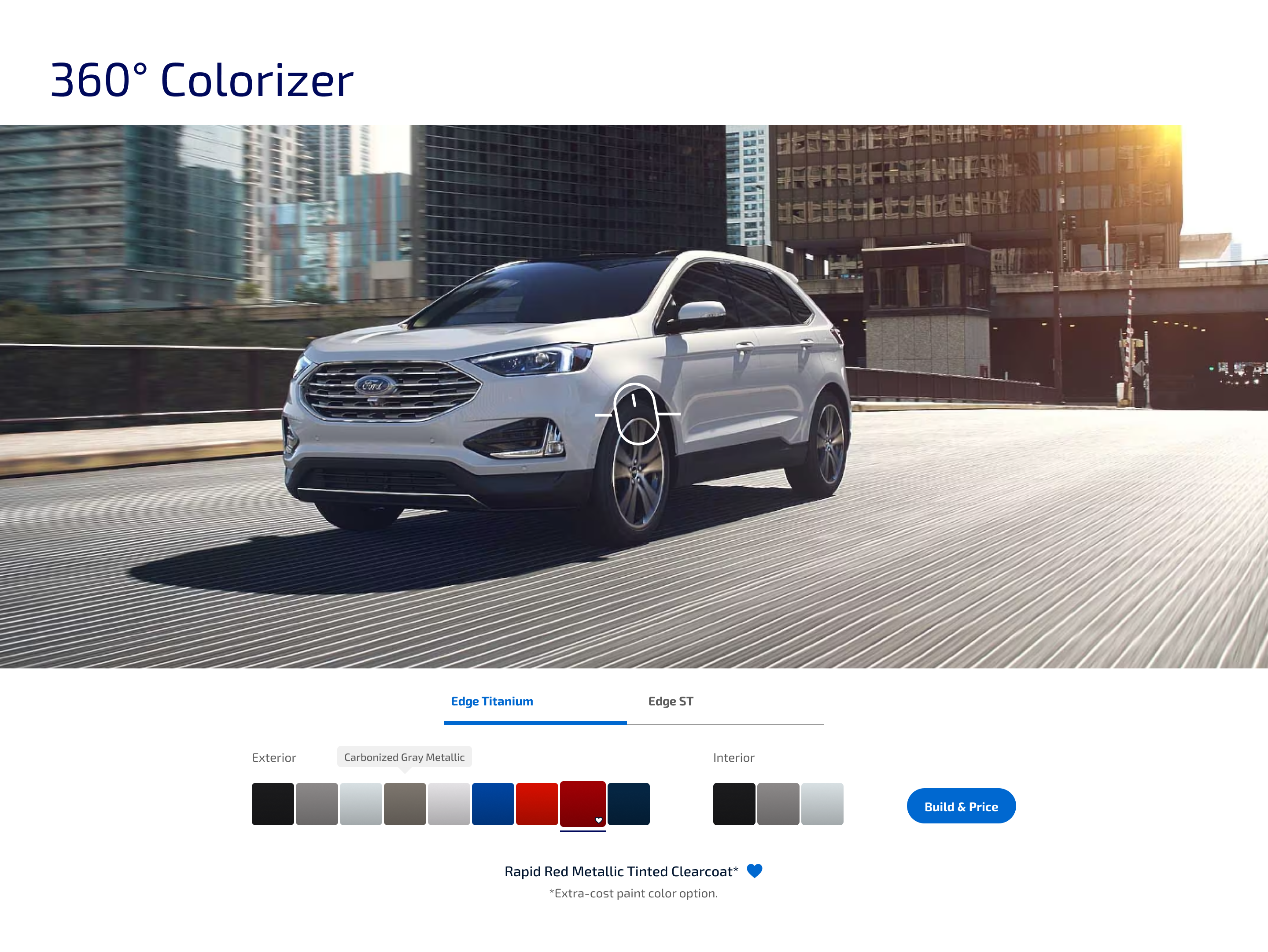
360° COLORIZER
- Made personalization easy and tactile with interactive vehicle color variations.
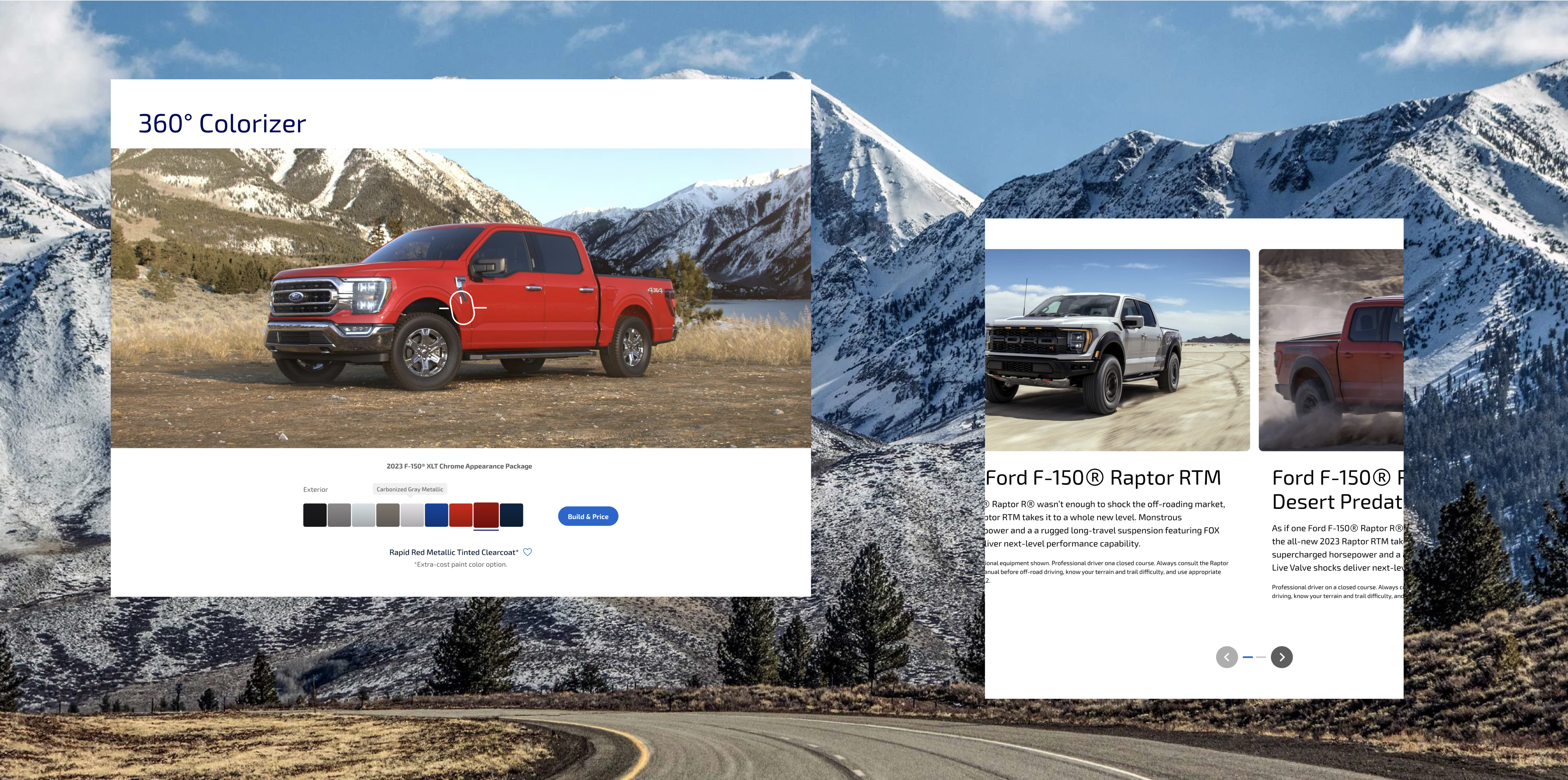
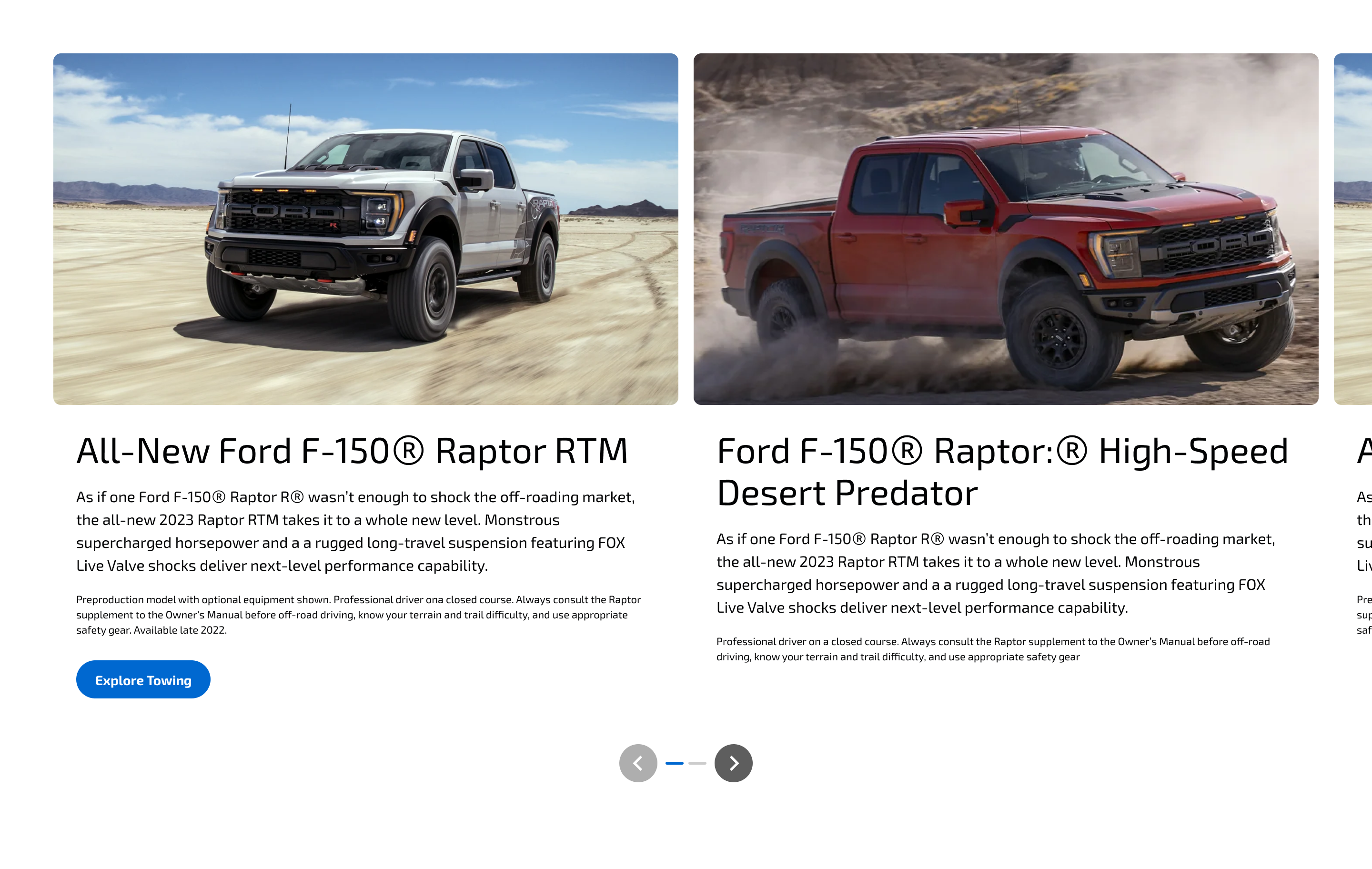
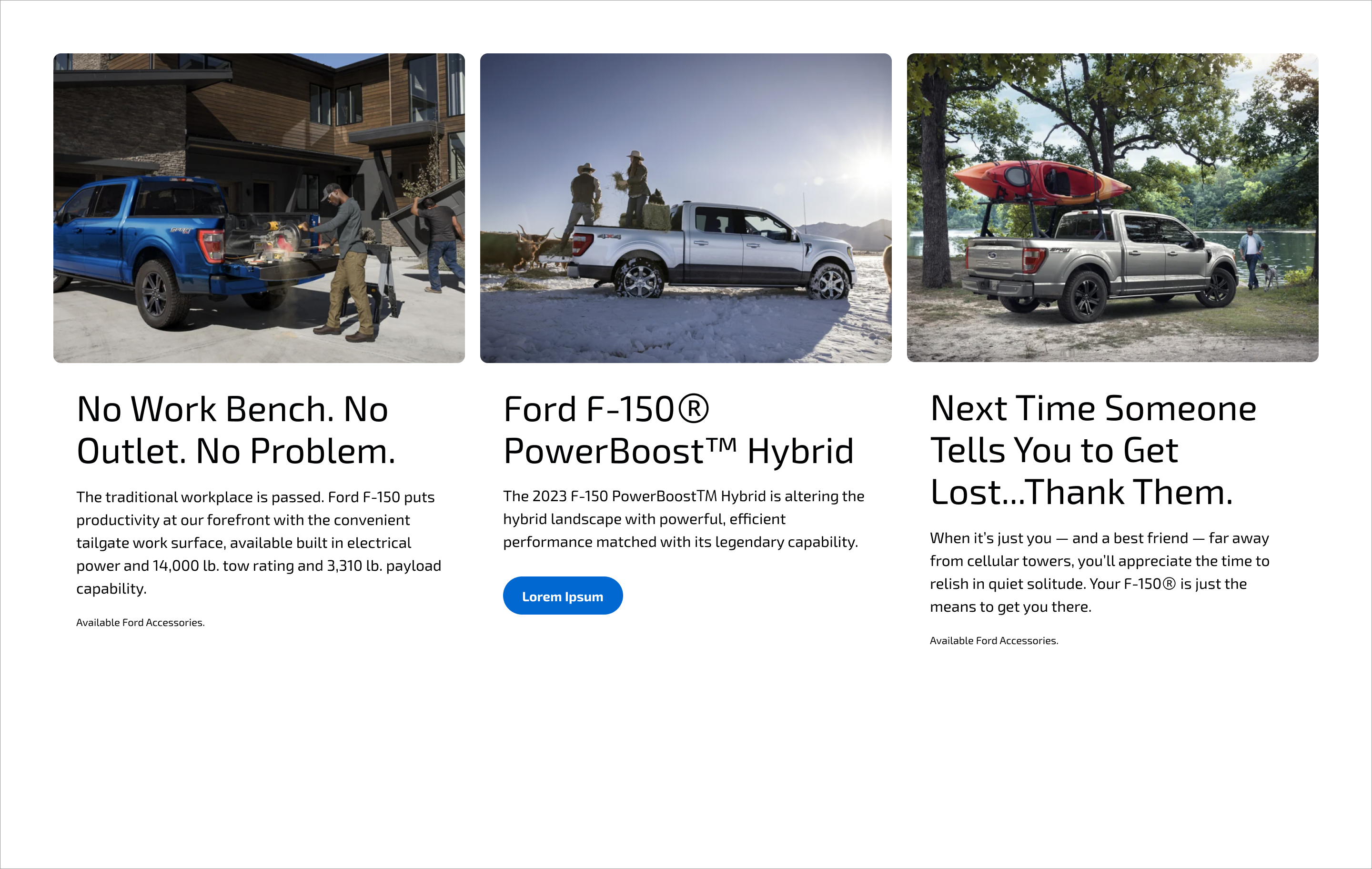
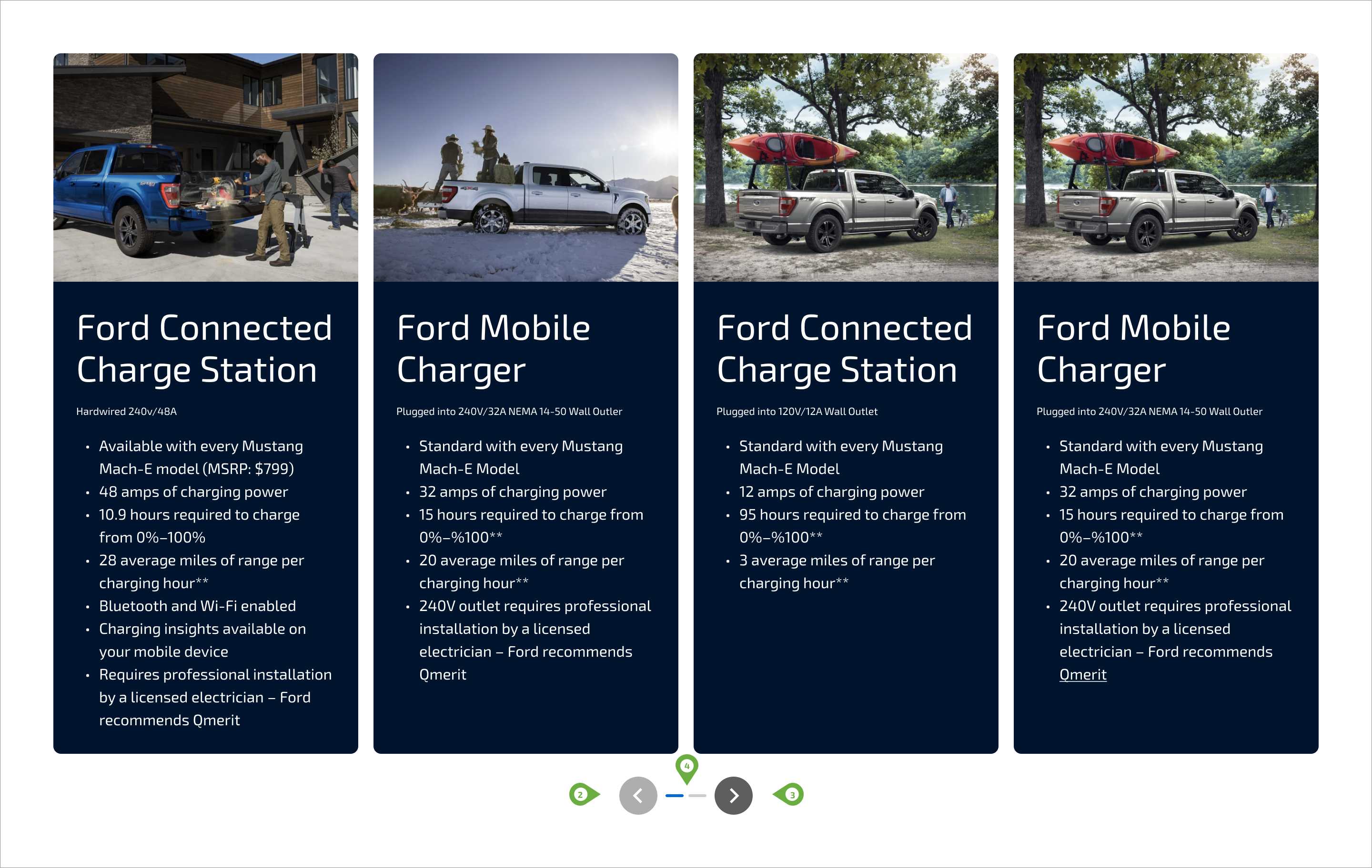
FEATURED CARDS & CAROUSELS
- Introduced a dynamic mix of imagery, text and buttons to diversify content presentation and keep users engaged
EYEQUANT DATA
SMART EYE-TRACKING
Before launch, we leveraged smart eye-tracking heat maps to identify distractions and competing elements. The data guided refinements that improved focus, usability and conversion rates.