Ford Motor Company
A DESIGN LIBRARY FACELIFT FOR THE ENTIRE U.S. & CANADIAN SITE
ROLE
Sr. UIUX Designer
Sr. UIUX Designer
TOOLS
Figma / Jira / Sketch
Figma / Jira / Sketch
TIME
Jan – Jun ‘23
Jan – Jun ‘23


Challenge
Ford’s digital platform lacked consistency, cohesion, and an easy-to-use experience for the consumer.
How might we maintain Ford’s established brand, but also modernize the design system and website?
Solution
We created design patterns and clear standards for assets and components to promote cross-platform recognizability.
The Holy Grail
Ford’s restructured design principlesCraft with intention
Authentic
Make decisions rooted in reason. Be thoughtful. Be purposeful. Be empathetic to human need.
Stir the soul
Passionate
Connect with people. Inspire optimisim. Spark imaginations. Create energy. Be bold but relatable. Tell real stories.
Let it breathe
Effortless
Make space. Create focus. Guide. We should be a breath of fresh air in a complex world.
Advance the icon
Purposeful ingenuity
Forward advancement is in our blood. we stay true to our visionary heritage by showing up in unexpected ways.
RESKINNED SCREENS
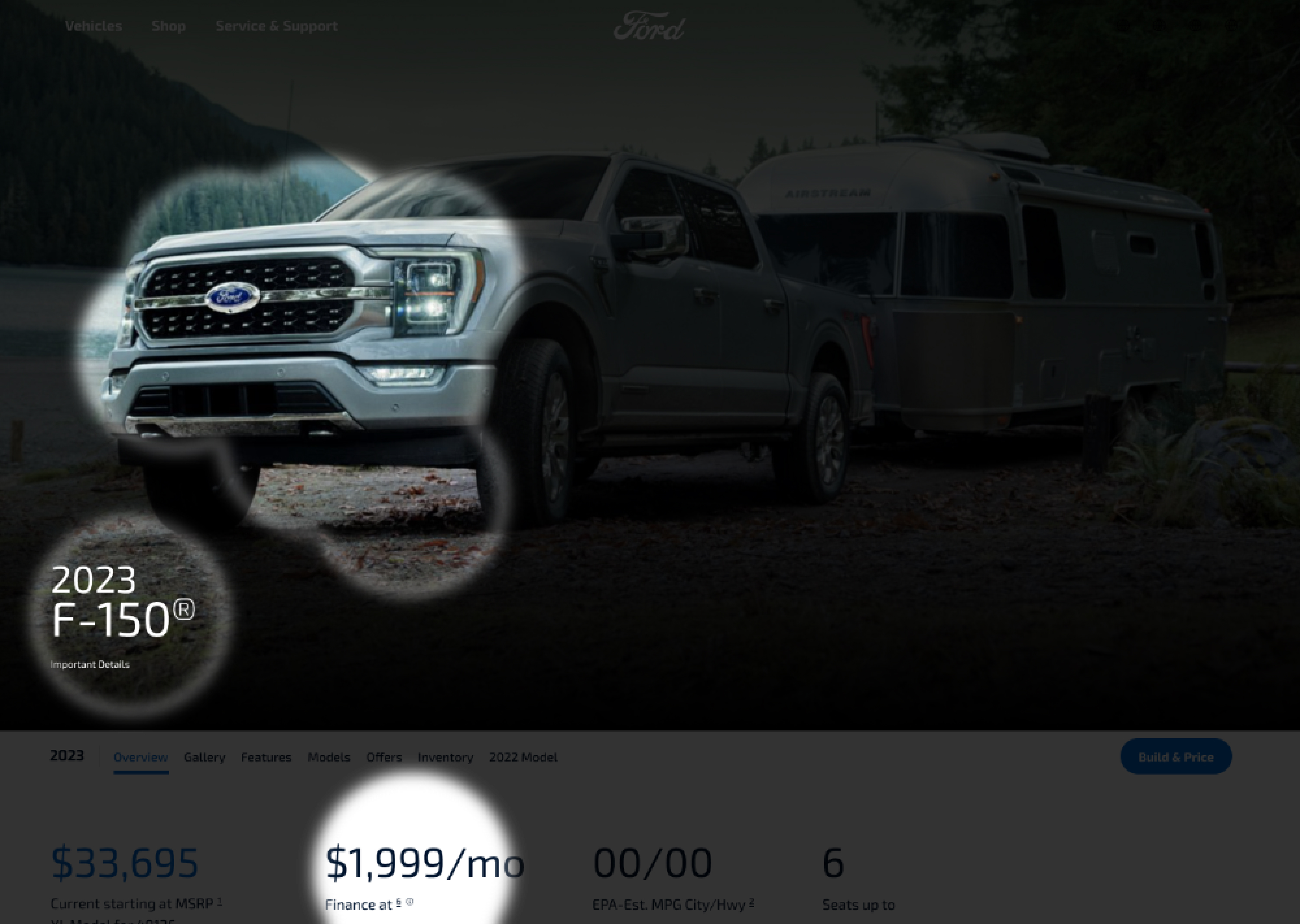
VEHICLE HOME PAGE
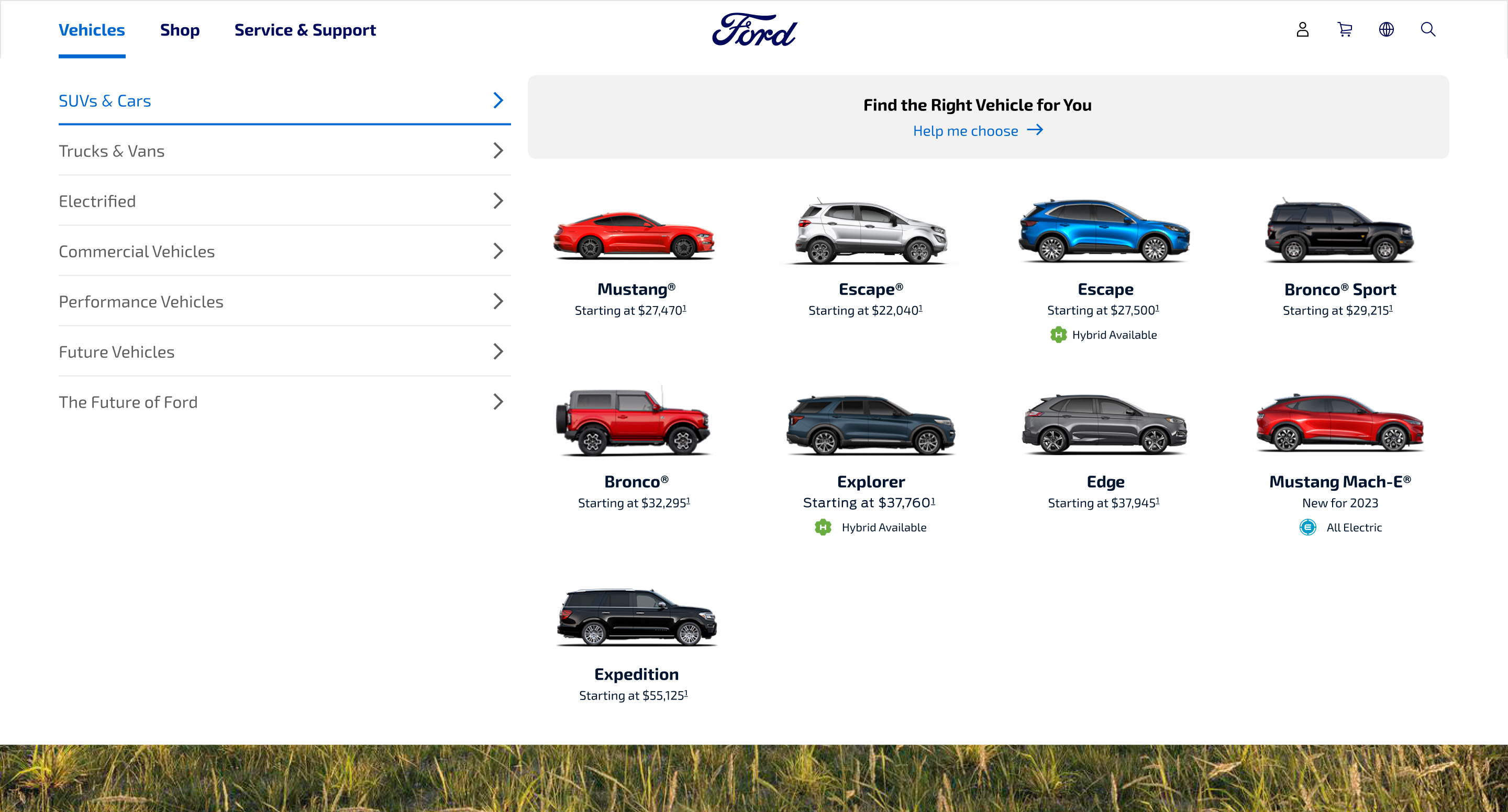
01. GLOBAL NAVIGATION
Reduced amount of clickable items for simpler hierarchy.
Reduced amount of clickable items for simpler hierarchy.

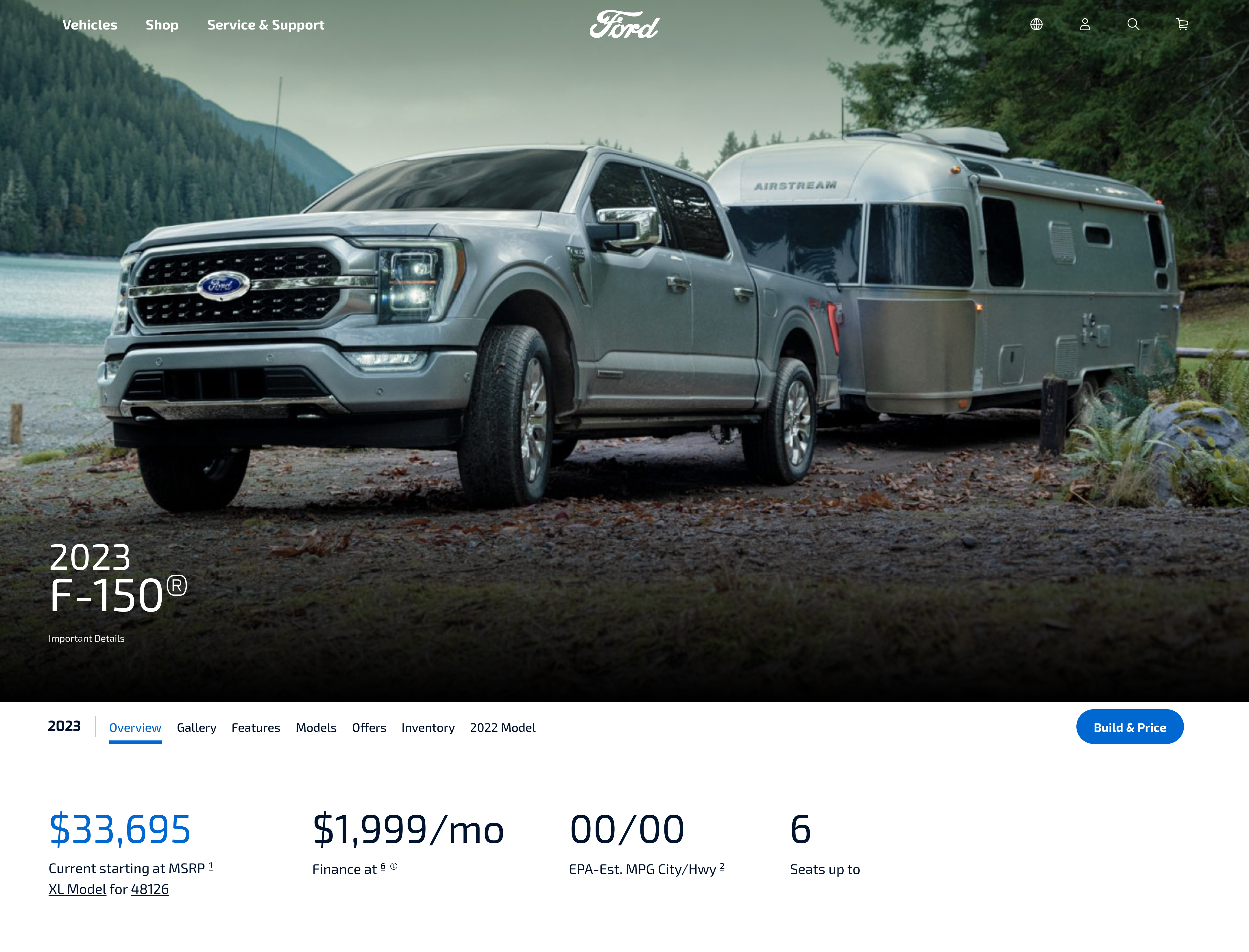
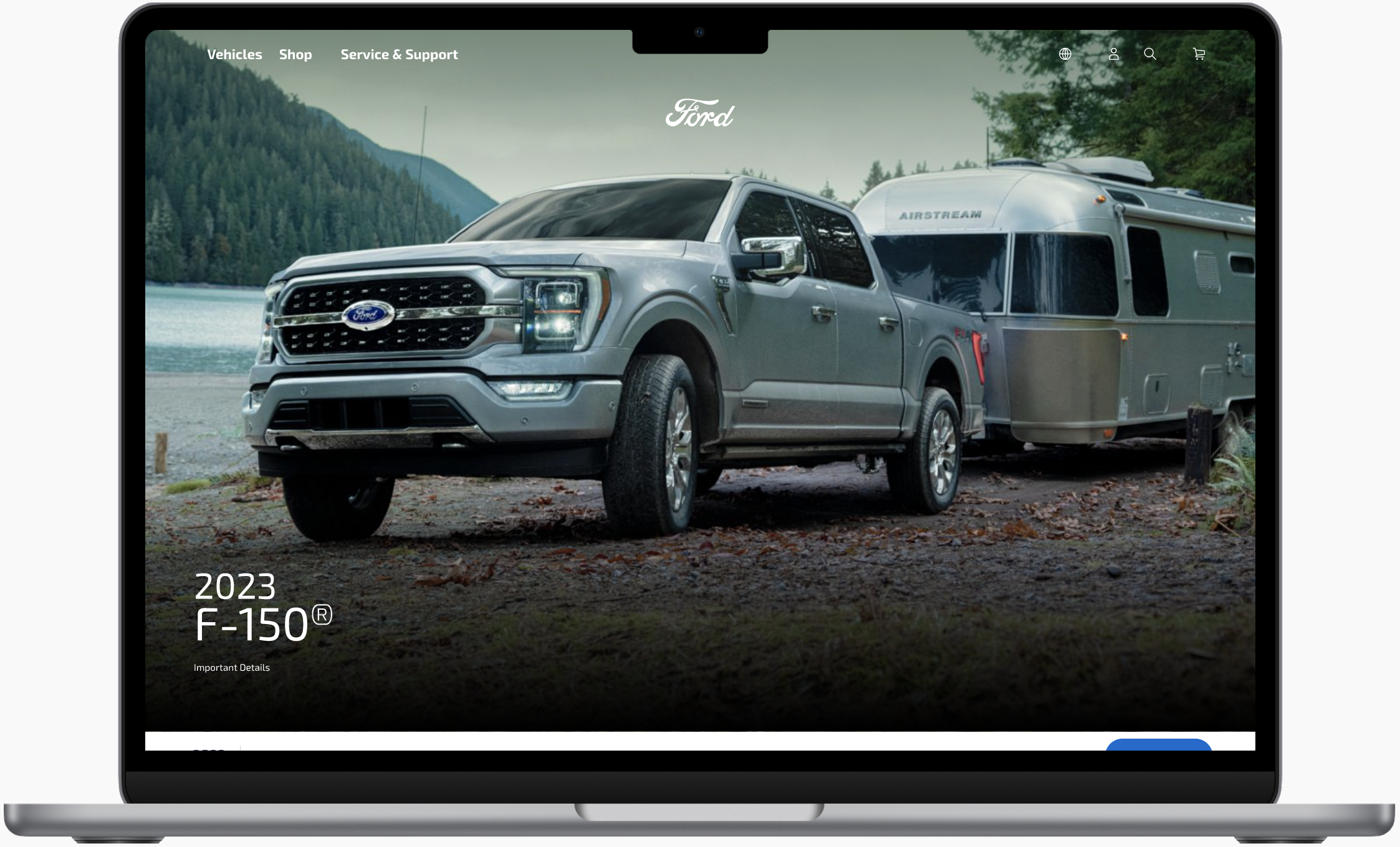
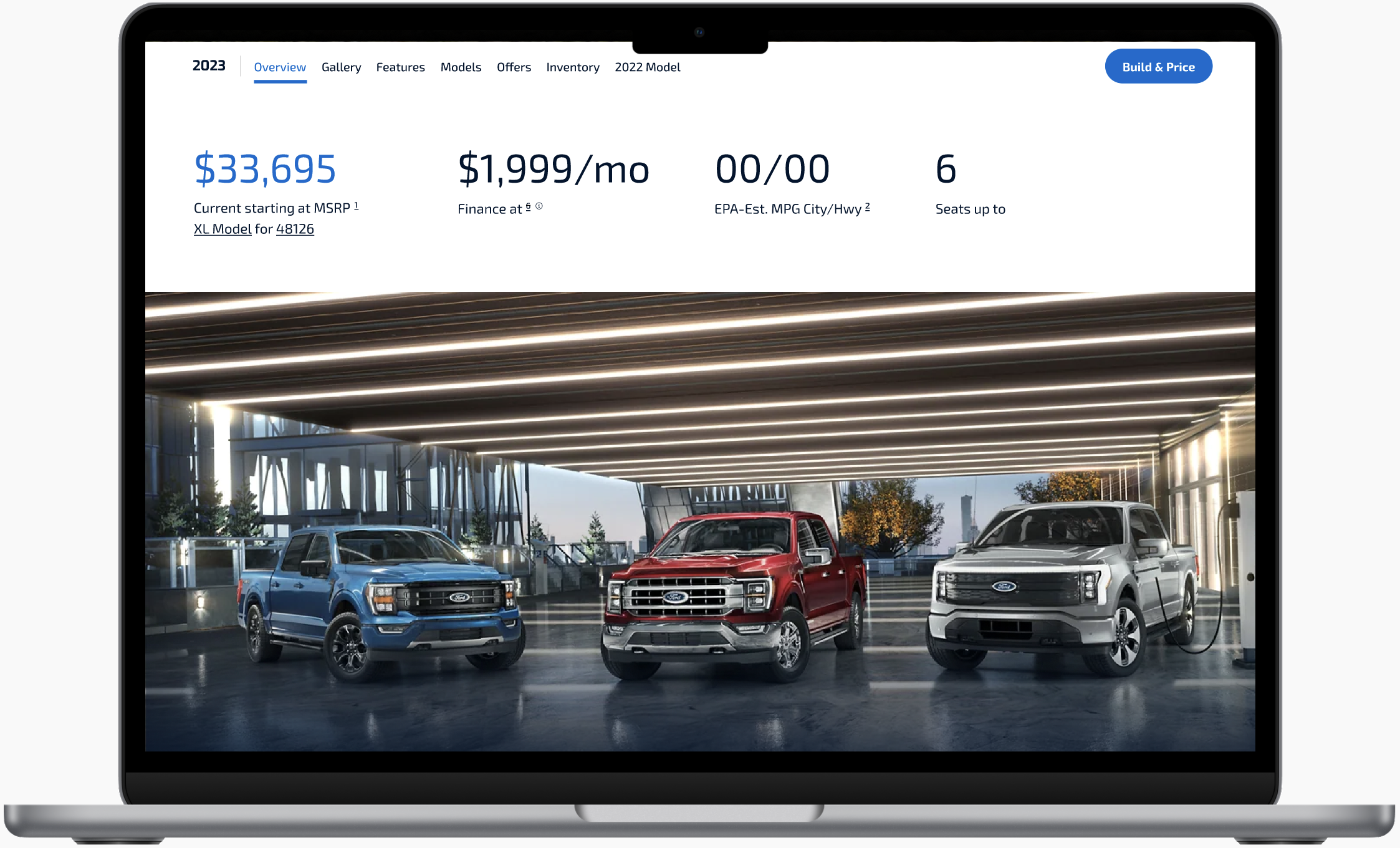
02 HERO, SECONDARY NAVIGATION, ATTRIBUTES
Emphasized vehicle imagery and key attributes.
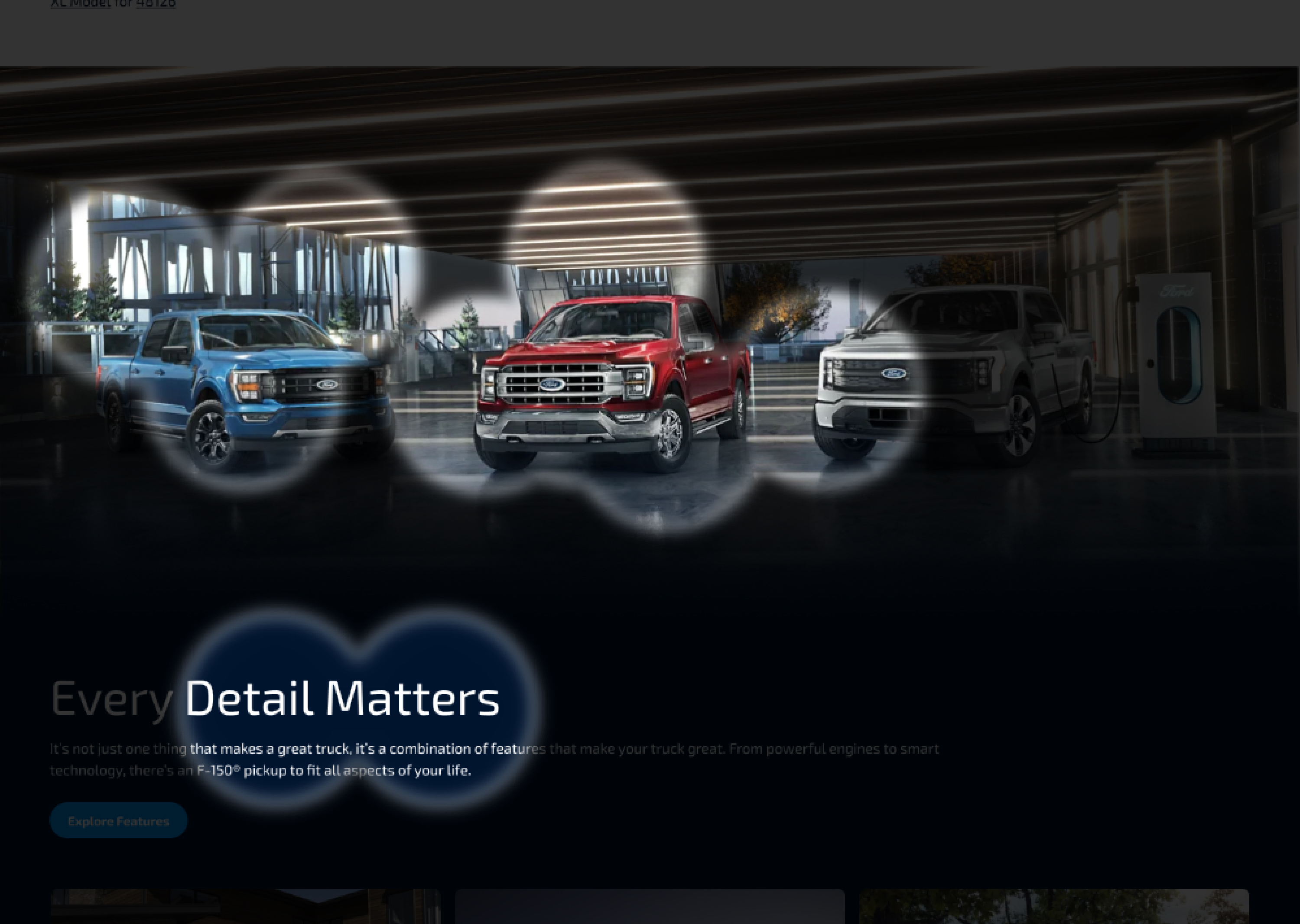
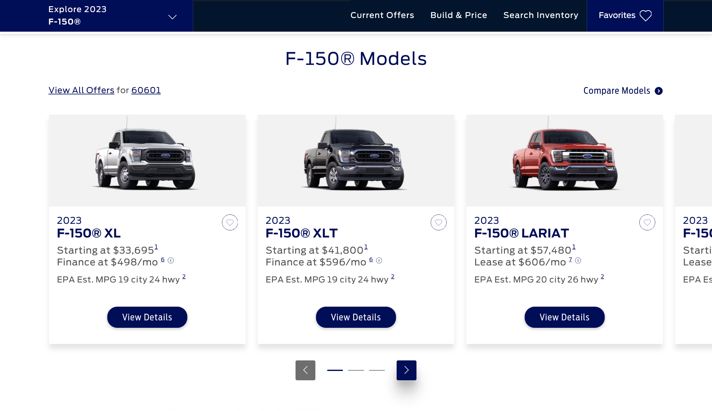
03 MODEL WALK
Restructured to help users compare different model prices.

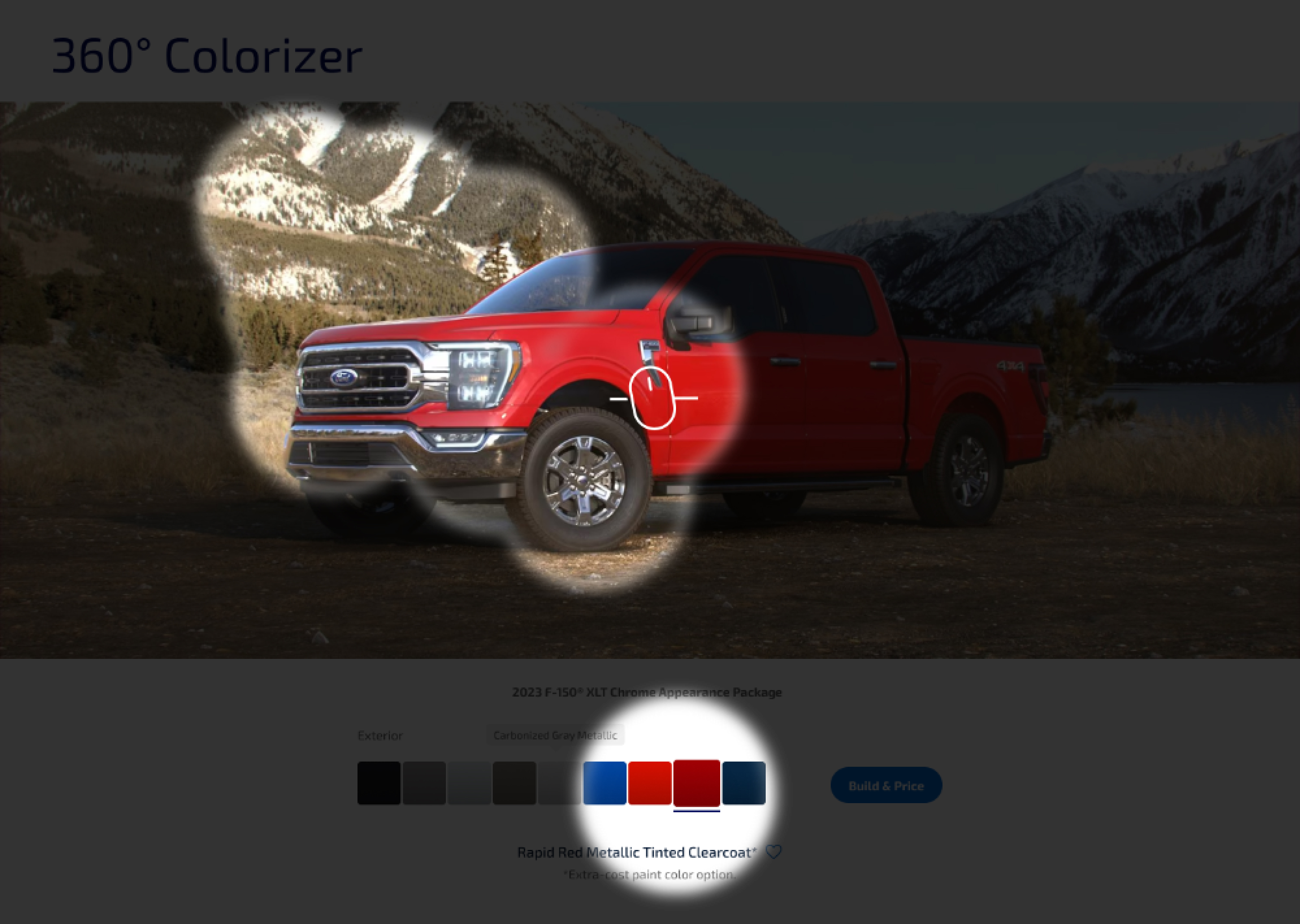
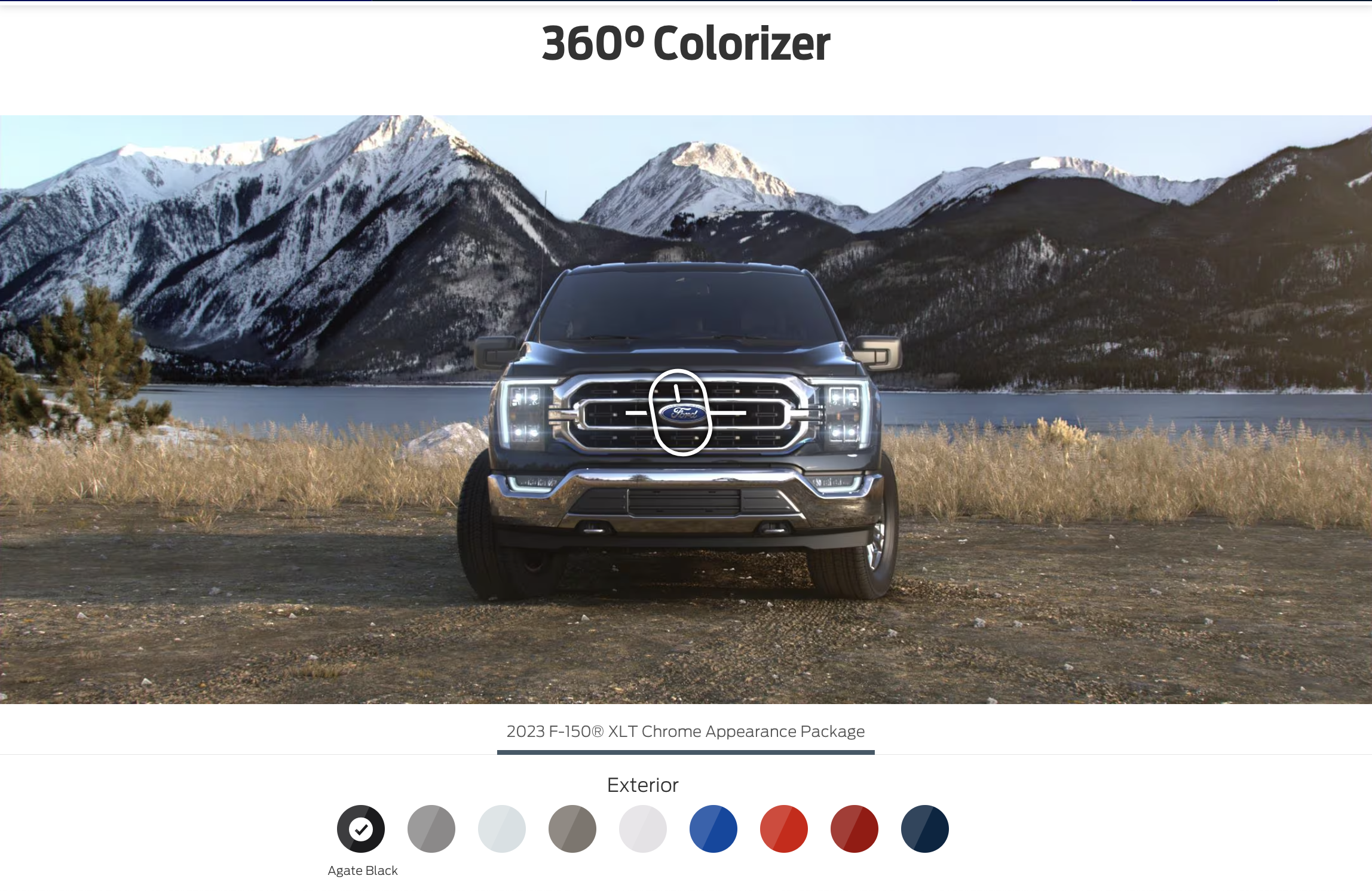
04 360° COLORIZER
Highlighted color variations of each vehicle type.
Highlighted color variations of each vehicle type.

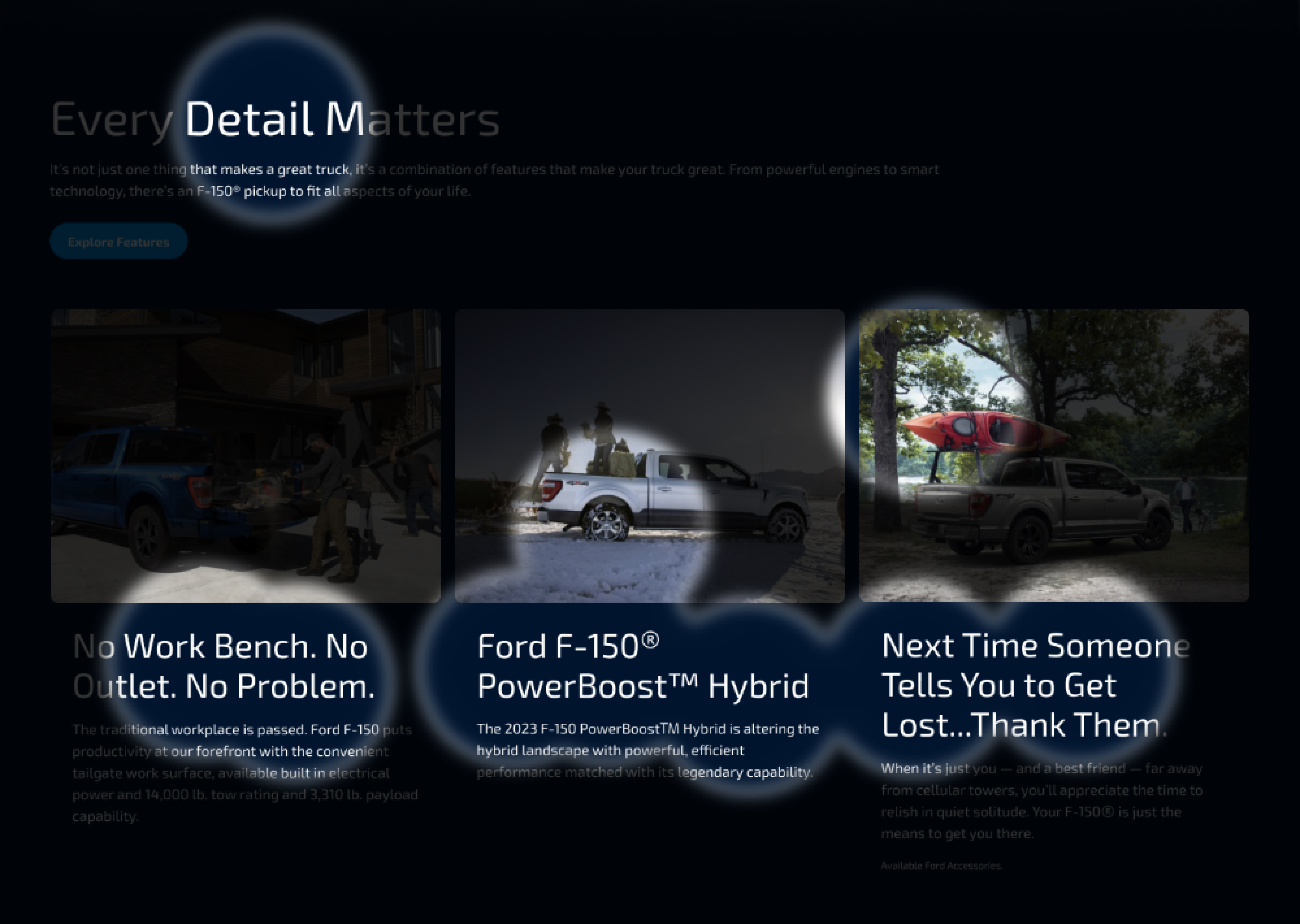
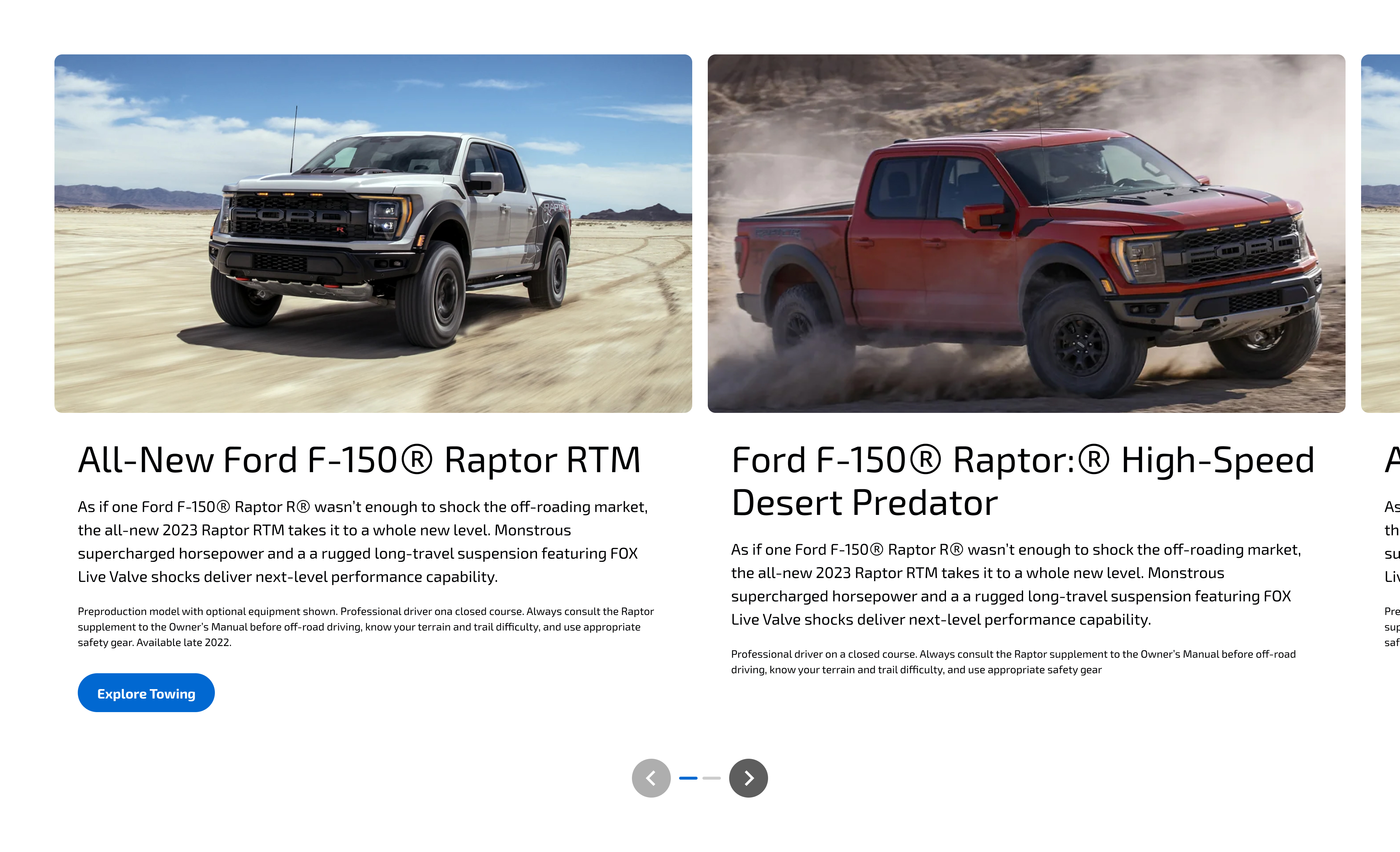
05 FEATURED CARD CAROUSEL
Added variety in content with imagery, text, and button componentry.
Added variety in content with imagery, text, and button componentry.
Before
Ford's design system lacked defined standards for brand expression, resulting in inconsistencies across icons, buttons, links, alignment, colors, imagery and components. These discrepancies created a dated appearance and contributed to an unreliable online experience.




After
By leveraging new design principles we organized and created structure, strategically used negative space, prioritized information hierarchy, removed extraneous elements, and incorporated motion to advance the experience and guide the user forward.


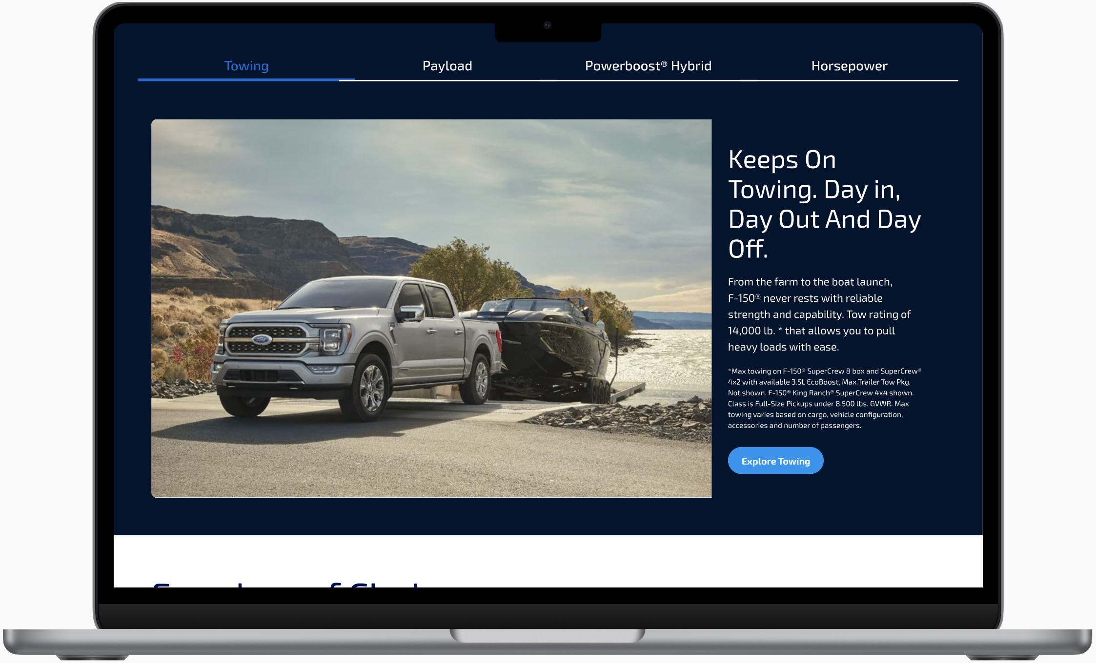


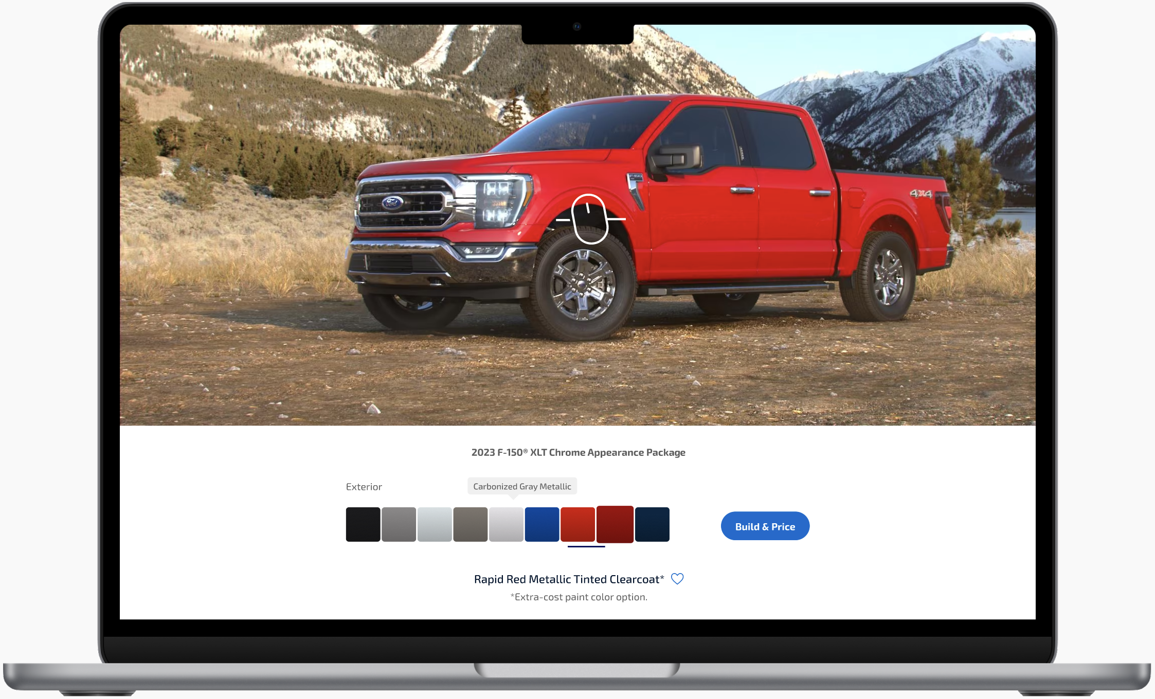
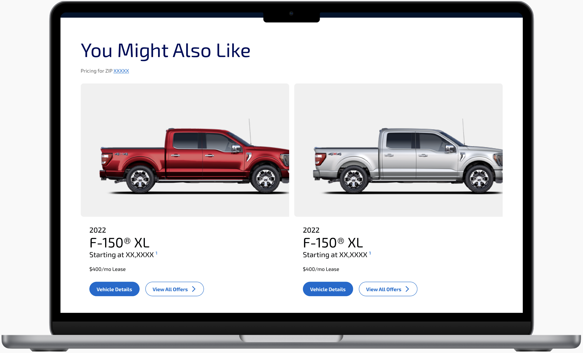
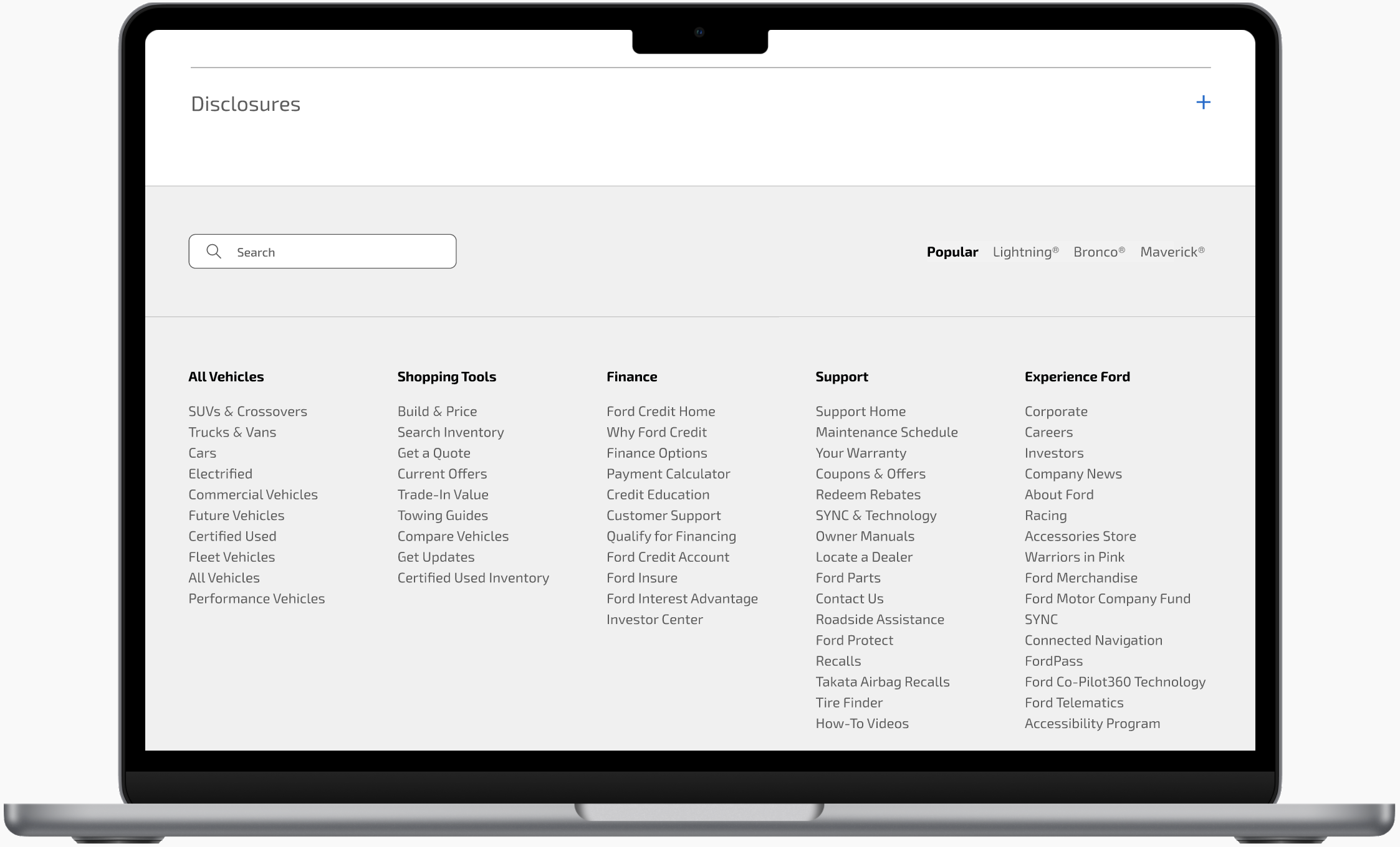
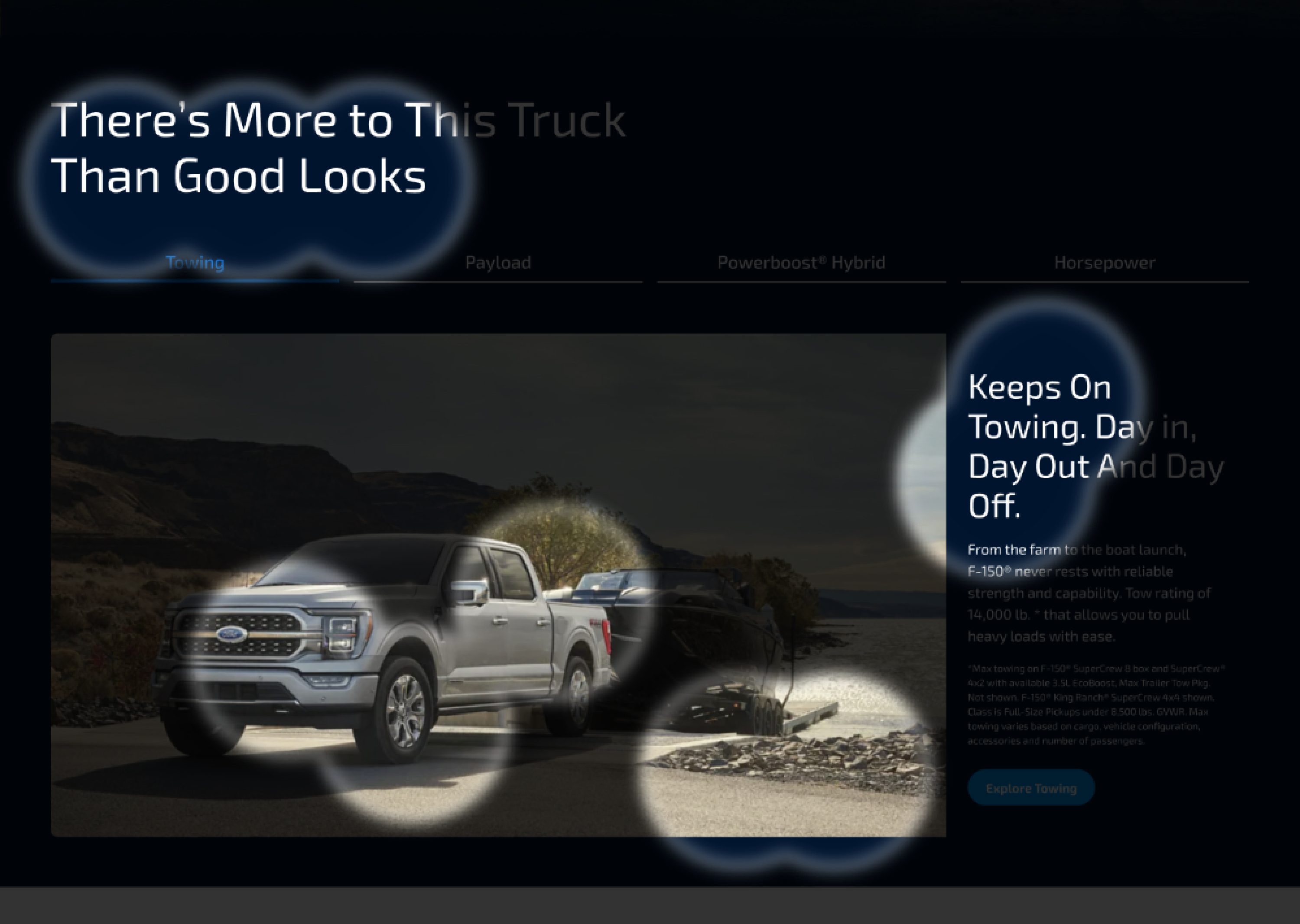
EyeQuant data
(smart eye-tracking)Gained instant feedback and data from intelligent eye-tracking “heat maps”. Understood which elements created a distraction or competed with each other to improve design and drive conversions before going live.
